Perspective City Drawing

0

Perspective Drawing
Brian Lin

In this summative assessment, we were instructed to design a one-point perspective or two-point perspective city after some practices of perspective letters. Compare and contrasting one-point perspective and two-point perspective would be that both designs are drawn for viewers to see in a perspective that fits real life. Both are designed to start with a horizon line and vanishing point(s), and drawn in eye levels: above, on, below. The difference would be the amount of vanishing point(s), for one-point perspective there is 1 vanishing point, for two-point perspective there are obviously 2 vanishing points. Vanishing point is the point at which receding parallel lines viewed in perspective appear to converge, in simple that is something that has been growing smaller or increasingly faint disappears altogether when you examine it. I chose one-point perspective in this summative assessment because it happens more often in my real life I predict what I draw will be more realistic than drawing two-point perspective city.

I started my city obviously by drawing my horizon line and vanishing point, and it kind of goes in a pattern, because mostly everything goes towards the vanishing point other than horizontal and vertical lines which are either parallel to the horizon line or perpendicular as it is a vertical line. My first object in my city is a road, 2 lines, endpoints are on the vanishing point, then finishing off the road with shorter but thicker lines in the middle, that divides the road up into two parts as in real life is. Obviously, the lines has to go towards the vanishing point too. At this point of drawing, I’ve acknowledged one thing: as lines are closer to the vanishing point, it becomes smaller, and lines that are further away, are larger. For example in my sidewalk bricks, the spaces between each brick gets smaller as it goes towards the vanishing point, in real life, it is too! Huge buildings eventually gets smaller as you move further away from it, not actually getting smaller, but from one’s eye level perspective, it does.

I demonstrated different shapes too, in my perspective drawing city to show that I could perform one-point perspective not only just with straight lines, with arcs, circles, even curved prisms too! In fact, my objects all showed quality in space because it matches up real life, the proportions of ratio in different objects doesn’t have much difference, which makes the city more realistic. My artwork doesn’t include any color, but value, value by pencil. In perspective drawing, it is like 3D objects that people see. Object that has faces, I demonstrated and showed different faces by coloring different values for different faces. Emphasising the lines will be more easy for the viewers to know what you are drawing and not get confused. I somehow showed balance in different objects I drew, so it looks realistic. It the drawing in perspective art is not balanced, no matter how accurate you draw, it doesn’t seem realistic.

Overall in this summative assessment, I think perspective art is really cool, it’s like when you see something in real life and drew it out on the paper with the same perspective. Every detail shows unity, creativity, and harmony. Of course, movement is the largest part or perspective art, my artwork demonstrates movement by objects and angles, every single line and details. To conclude my artwork, the objects I drew includes road, mountains, buildings, letters, fence, train, and railway.

Comparing my work to others, in my work I demonstrated less lines than my peers, but more presented in more details, in my peer’s work, he demonstrated a solid knowledge of creating buildings and the concept of lines to vanishing points, more in detail, he understand what line goes under or above another line. Shapes in my artwork is demonstrated in a variety of ways, while my peer’s artwork only demonstrate prism like shapes. I included in curved prisms, rectangular prisms, cylinders; in different sizes. Somehow I think I demonstrated more in space by including 4 roads with 3 different directions. However, my peer did good too by making the road big and clear while it is a two-point perspective. Color didn’t really affect how one looks at my artwork, because the lines are well measured with precision. However, my peer colored in his artwork so it looks more line one. Overall, I demonstrated more in value with my pencil while my peer colored in fully. With just one color; my pencil, I have to demonstrate good value to divide up different sides so it looks 3D.
Ceramic Garden Reflection

0

Brian Lin
Ceramic Garden

To start processing my ceramic garden, I start of with cutting clay from a big piece with the wire cutter to get the amount of clay I need to balance form in Harmony. I prepared a canvas, tool box with various tools, and a bowl of slip that I might need for my table. After having the amount of clay, I did wedging to the clay with my hand to bend the clay to make it softer for me to design afterwards, in fact, to push the air out of the clay to make sure it doesn’t blow up in the kiln. In the kiln, it is like an oven for clay, where clay gets heated up, if you don’t know, objects expand when they are heated up, same thing to air. When air gets trapped inside the clay, they have nowhere to expand, eventually, they will crack the clay from the inside, and find their way out, which creates an explosive-like scene.

To make an ideal ceramic garden, I brainstormed ideas with unity so it demonstrates my creativity and show emphasis to differ the work between myself and others, or even show emphasis to my work compared to my very own work. I thought of making a scary garden scene in the very moment so I decided to make jack o’ lanterns to represent the theme. To conduct my process to make the jack o’ lantern, I started with a sphere, then put force from the top so both bases are kind of flat and it is like a thick cylinder with the sides like a sphere. Having the 3D pumpkin shape, I added texture to it which are lines I carved around the sides of the pumpkin in a pattern, which felt bumpy. Then I carved the facial features of the jack o’ lantern, I made them all have triangular eyes, I carved in so it is steeper than 0.5 cm, with the pointing tool first, then realized it wasn’t precise enough because the dot was too big, so I changed and used the needle tool where it is thinner and easier for me to work with. I made 3 jack o’ lanterns with different proportions, In contrast, I stacked them up from bottom to the top, biggest to smallest in order. I rotated their faces to different directions so it creates movement because of their direction they are facing, guiding the viewer’s eye. To make all 3 jack o’ lantern stand still, of course we had to do the score and slip, I spent a long time to score and made sure I had created the roughness and steepness to the surface of the clay with the scratching tool, then added some slip which made them sloppy. At this time, I have to push them together with some force, to make sure they’ve become one piece, but I had to control my force so I wouldn’t destroy their form. After having the 3 jack o’ lanterns stacked together, it looks like a snowman, but with a piece of root at the very top of the 3 jack o’ lanterns, which in this case is the smallest one. What I did to the root was the same process of score and slip, but in smaller area I scored and smaller area I slipped, my 3 stacked up jack o’ lantern was completed in unity, but I continued to spray water on them consistently to make sure it doesn’t dry so fast in order to avoid further changes afterwards.

I wanted to make a treehouse with a door at its trunk, and some windows in the upper part of the trunk, so the basic knowledge of my idea was not to make a house on top of the tree, but making the whole tree as a house, where there is a room inside, by the entrance to the tree trunk. However, my thoughts changed as I tried making the tree trunk by cutting another chunk of clay with the wire cutter. This time, same process in the beginning, I did wedging and created a slab into a rectangular shape, wanting it to be more like a cylinder shape, I continued doing my slabbing, which did not turn out good. So, I started to coil my clay on the canvas, required rhythm in doing this skill or the shape will look weird, which made a strong cylinder shape. I started to add texture on the sides of the cylinder, to make it more like a natural trunk, some fingerprints which made them look like bumps. I do not want to make branches and leaves at this point, I wanted to make a simple rooftop to cover its top. I started with another piece of clay. I started to slab again, until it turns out into a pizza shape, already with texture on it, with curiosity, I placed the flat circular clab on top of my trunk, this is where my idea started to change, it looks perfectly like a mushroom… a giant one! I took the “mushroom” top down, it’s not a rooftop anymore, it is a “cap”, scientific word for mushroom’s upper part. So, I took it down and starting to add more textures onto it, to make it smoother, but bumpy by texture, so it’s basically smooth on the bumpy. After that, I slabbed the base of the stem of the mushroom to make a flat surface so it could stand on its own. I scored and slipped the stem to the cap, which was a real success, then made another long thin coil and sticked it around the edges of the place where I scored and slipped, I guess it made it more stabilized. With the same process, I made another mushroom, with a bigger cap! After all three of my works turned out well, I grooved the stem of both mushrooms with rhythm so it looks like a steep hole with patterns of digging lines from the side. From the bottom, but doesn’t affect the appearance of the mushroom when placed on a flat surface. The purpose of doing this action is to make it dry faster, and have a less risk of experiencing the clay to crack or explode.

The final object I made was a R.I.P. grave with my name carved on it. I had a small piece of clay, made it into a rectangular slab, then smoothen the top to make it curve like an arc. Then carved my name and the R.I.P symbol with the needle tool.

I enjoyed most of this unit when smoothening up the surface of clay with water, and creating texture, which I demonstrated both skills most in creating the mushroom. The mushroom made it easy for me because it was big, and not small which will make it somehow hard and confusing like the jack o’ lantern when carving their facial features. I demonstrated a lot of knowledge in score and slip, I understand how the skill works and tried my best to conduct and make it work out, eventually, it did. The space I created in placing my objects: mushrooms, jack o’ lantern, R.I.P grave could be random, because I didn’t create a base for them to stick on, which is not required also. Overall, I liked working on clay, I think I developed a lot from 6th grade onto now, where I have more understanding and knowledge.

Tessellation & Self Portrait

0


IMG_9430

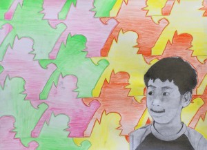
This artwork is about tessellation. Tessellation is about shapes that doesn’t overlap each other and doesn’t have gaps and spaces between each other, they fit exactly between each other. Self portrait is when you draw yourself by a picture taken, but drawing yourself in another paper. Tessellation is like Pattern, we colored our tessellation also in Pattern, so it wouldn’t be strange, like a rhythm, when you sing a song, it would sound smoothly, like tessellation.

I choose to balance  my Tessellation project because things should be balanced in all ways, I use 2 colors on left, 2 on right. The lines I drew for my self portrait is very accurate and precise, they show different values. Sometimes I made changed the type of my pencil, this movement is used because I need to make some part more dark and some lighter.

I choose this shape  for my tessellation because it is COOL! Some parts are spiky, and some are round. I can see the lines i drew and the color I colored from far away. I think others who saw my project can see the I (self portrait) am looking at the cool tessellations.

I want the viewers to feel the harmony of the tessellation, and the different variety of my self portrait.

MYP ART Y1 Name Slab

0

IMG_8326

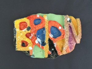
This ceramic project is making a clay slab that is shaped in my name, which is B-R-I-A-N.

In this project I learn many types of materials, like canvas, wire cutter, scratching tool, dotting tool, needle tool, slab, coil and slip. First we use the wire cutter to cut the clay into half, I wedge the clay to make it thinner and bigger. Next I use my dotting tool to cut out my name. After that, I made the clay into a slab, so I could put my clay name on it. Finally, I decorated it and make it more interesting.

To make it more creative, I decide to overlap the letters on my name, like B first, R overlapping B, I overlapping R, A overlapping I, and finally N overlapping A.

On my Slab name, there are patterns that you can identify, the first word, middle, and last is the same design, the 2nd and the fourth has also the same design. The value of each letter is the same, i left many Spaces after each letter to make it more creative and not confusing. Balancing the use of clay can be useful so you won’t run out of clay or your clay won’t explode. The rhythm  i used is that everytime when the clay get loose, i would flip it to the back and make it stronger, and it goes on and on.

In the middle of making the clay, I have problems sticking the clay, then Ms Oda told me to flip the clay to the back and put more clay on the weaker part. We don’t have to care about the back because people won’t see the back, only the front. After I made my clay stronger, it became more AWESOME!

I really like this project because it teach me many thing like we have to dry out the clay and we have to push the air out, this is called wedging.

The part that I wanna do again is to Score and Slip, because it’s a cool name! And… I like putting the mud clay on and making them sticking together… it’s like magic~!!

In this project I did not coil, because I don’t think it’s necessary for my clay, after I cut my shape, it is already there.

After I finished this project, I learned a lot of things, be prepared, like I always come into the classroom 2 minutes earlier to prepare for the clay, once the bell rang, I can start working on it.

Value Landscape

0

IMG_4290

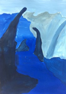
In the emphasis in the drawing is the curving stones that is tilting and surrounding the blue river. I chose it because it’s. When I’m drawing this landscape, I learn about how can tint and shade make the each object and ground look different, the object that is closest to you needs to be shade, and the object that is farthest needs to be tint. It’s the same color but you can make it so different and easier to know.

I think warm color makes the drawing becomes joyful and people can enjoy, but the cool color makes the drawing becomes the opposite feeling of the warm color, everything becomes sad, like peace. I drew lines on this landscape to make myself clear what I’m painting My lines are good because I didn’t really use ruler, I just drew the nature, nature can’t be straight and good and perfect. Each Shape are different and has different values to separate grounds.

At first I drew a landscape from India, but I realized it has too much details, so I compared and contrast my landscape with this one, and realized it might work out better with this. For conclusion, I think every grounds should be more different and more clear. I did good on my tint, but i need to work more on my shade.