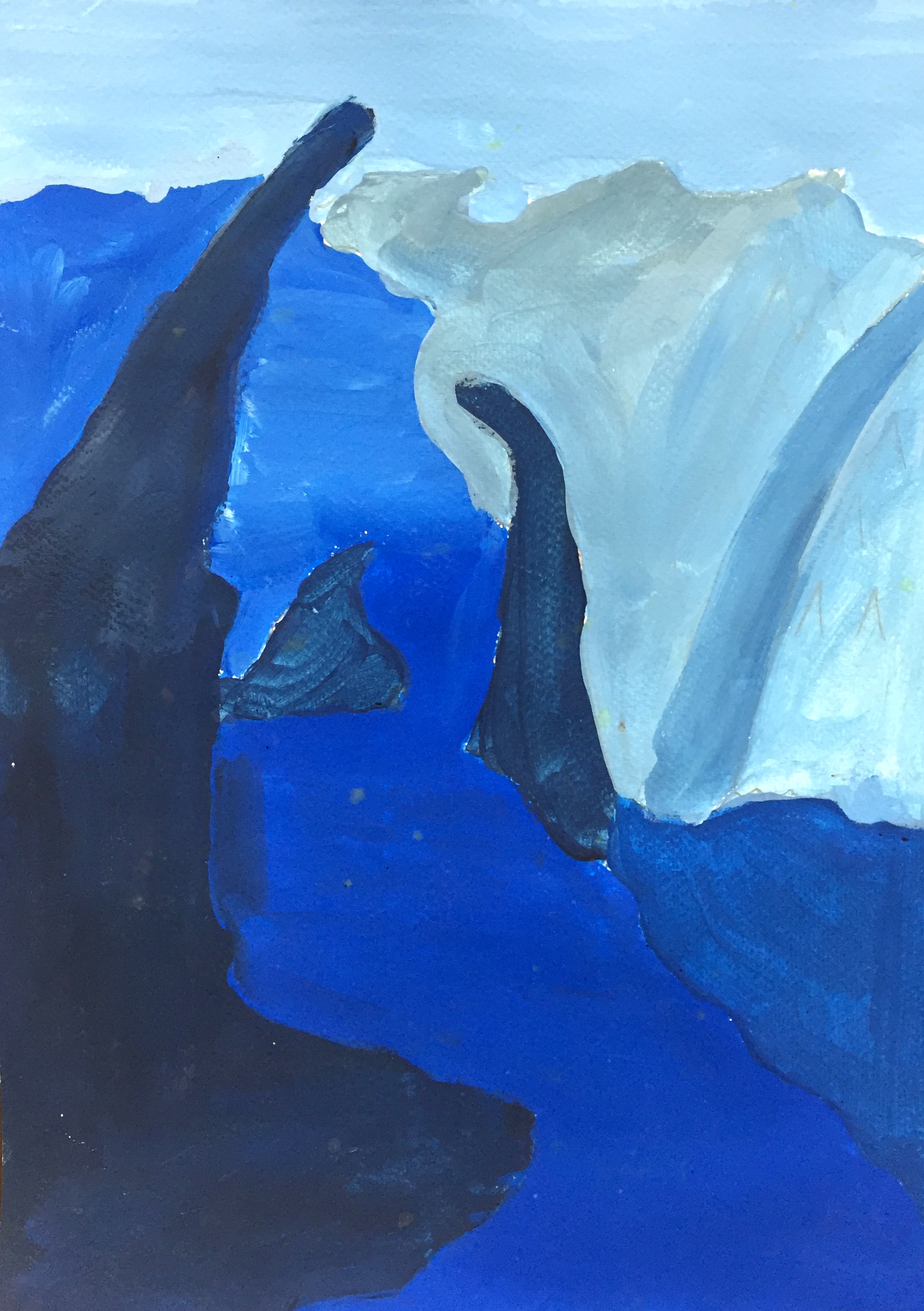
In the emphasis in the drawing is the curving stones that is tilting and surrounding the blue river. I chose it because it’s. When I’m drawing this landscape, I learn about how can tint and shade make the each object and ground look different, the object that is closest to you needs to be shade, and the object that is farthest needs to be tint. It’s the same color but you can make it so different and easier to know.
I think warm color makes the drawing becomes joyful and people can enjoy, but the cool color makes the drawing becomes the opposite feeling of the warm color, everything becomes sad, like peace. I drew lines on this landscape to make myself clear what I’m painting My lines are good because I didn’t really use ruler, I just drew the nature, nature can’t be straight and good and perfect. Each Shape are different and has different values to separate grounds.
At first I drew a landscape from India, but I realized it has too much details, so I compared and contrast my landscape with this one, and realized it might work out better with this. For conclusion, I think every grounds should be more different and more clear. I did good on my tint, but i need to work more on my shade.