Letter Sculpture
Outline WHAT YOU DID:
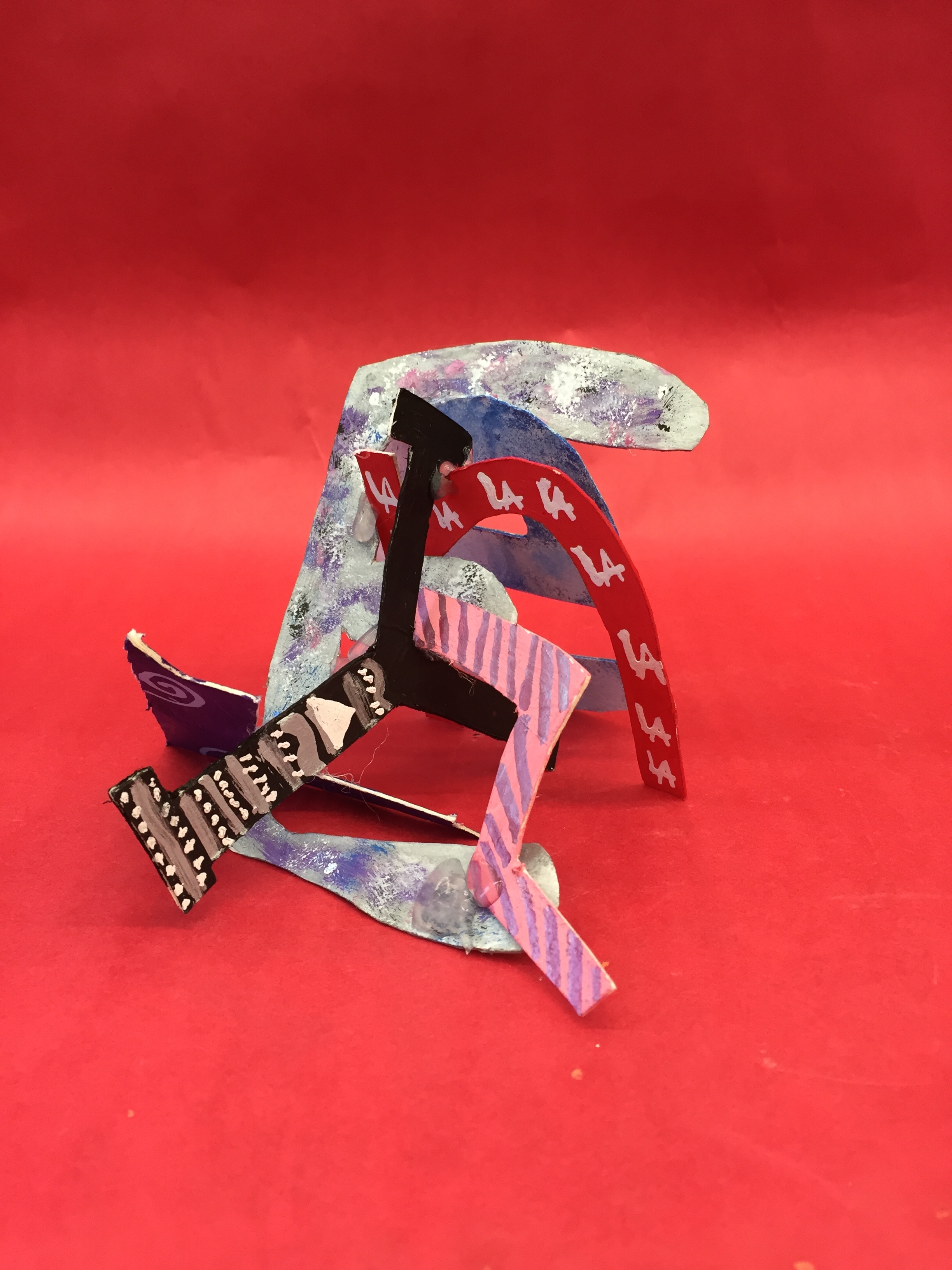
I made my name in different fonts, different colors, and different design. For the letter “E” I tried to make it look like splash paint with many colors like pink, blue, white, purple and black. For the letter “V” I colored it purple with swirly designs and red, white and blue dots. For the letter “L” I colored it pink and used a metallic purple marker to make lines, and blue dots. For the letter “Y” I colored it black and did lines, dots and triangle as the design. For the letter “N” I colored it red and drew the LA all over it with the colors red and blue.
WHY YOU DID:
I made the letter “E” look like splash paint, because it’s my favorite type technique to do while i use paint. I made the letter “V’ with swirls and dots because it was simple and easy designs. I made the letter “E” with white and blue to look like the sky with clouds. I made the “L” with line because the line looked like candy to me. I made the letter “Y” with dots, triangle, and lines to make it look like the designs on the henna tattoo. I made the letter “N” with LA all over it because I’m from LA and i was born in LA.
[What is good? What is good in other’s work? I thought that Anastasia’s work was very detailed and cool. She made a illuminati on top and marble effects. I thought her work was very cool and looked very interesting. She drew very detailed patterns. I don’t really think there is anything to improve for her drawing.