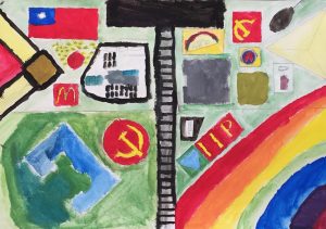
- In the final summative of art, we made this perspective drawing, there is one point and two point perspectives, in the one point perspective you have one vanishing point while in the two point perspective you have two vanishing points. The basic difference is that in one point you are looking at its front but in the two point you look at its edges. A similarity is that both perspectives is going to have one horizon line, which is a horizontal line across your paper which you can put anywhere. The horizon line also serves as your eye level, which is where your head is supposed to be. The basic principle of drawing these things is that all vertical lines should be perpendicular to the horizon line and all the horizontal lines should be parallel to the horizon line. It creates a weird movement in your drawing when doing this because it feels like you will move forward, depending on your value and color control, you can create an emphasis or balance in your drawing. Shapes are essential in this drawing, because you want to create a 3D image. That is pretty much it.
- I thought, oh no, please no, I don’t want to do this, which created the abomination that it is. My entire head just went blank, and multiple things popped up, I forgot them and the words oh sh*t popped up in my mind as my brush falls on the ground. That is basically what happened the entire time.
- Line: All I know is that I made a bunch of lines and connected them to create some kind of weird disgusting shape and added all of them together, my peers all did really well, I did the worst, not gonna get into the specs, but basically I messed up.
- Shape: I don’t want to get into this, but there are many weird shapes like flags, buildings and communist symbols. My peers had very good shapes, because they simply did well. Oh jeez why…
- Space: there are a lot of space in my drawing because I have no idea what to draw most of the time. My peers created space because they wanted to and it looks good, I made space because my mind is confused
- Color: I really don’t want to talk about it, I messed my paint up. My peers… did good, because blah, same stuff.
- Value: I messed up really hard on my value, everything looks pretty much the same, my peers did a great job, I don’t want to talk about this one.
–––
- Unity/Harmony: I can’t, I can’t paint these things, I can’t draw these things. I can try to make everything symmetrical, maybe that would help. Make the value on everything the same with similar colors.
- Movement: I can try to make a map like thing to let the readers move through the drawing
- Emphasis: contradicting to tell me to improve emphasis and unity, I could make this one really dark thing in the middle of the entire drawing while everything is in unity beside it
- Balance: I can try to make everything symmetrical as I said on top.
- Contrast: I can make 2 different styles of drawings to create a contrast, like the angel and demon stuff, it looks different on both sides of the drawing.
