In math class, we studied about data and statistics. Our statement of inquiry was, “The way in which we collect, represent and interpret data, helps us to identify patterns, understand relationships and solve real-world problems.”
Today we practiced making digital graphs with Google Sheets. Below you can see my two graphs about Kaohsiung and Taipei average yearly weather.
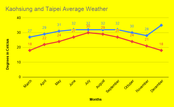
The graph above shows the weather difference between Kaohsiung which is the blue line and Taipei which is the red line.