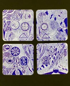
When I first started I thought about this fictional Egyptian symbol in the middle combined with native Taiwanese patterns. It’s is a combination of organic and geometric symbols, a rather busy piece of artwork with little space between the lines that I used. The circles that surround the centerpiece of my artwork was thought of during the making of the artwork. Quite simply I didn’t know what I should do to fill up the spaces, so I thought of an anime which had one character have these energy balls floating behind him in a circle, so that’s what I did. All the other designs were just whatever that popped up in my mind first, quite a variety as well from triangles to tentacles. I tried to make the space rather in harmony and in unity, because I’m not trying to emphasize anything or make contrast, even the centerpiece, it’s just a part of the meal not the main course. The reasons I choose the patterns was a combination of my thoughts and the music I was listening to, the rhythm helped me create movement and “rhythm” in my artwork, a looping cycle and a flow in the patterns, shapes and drawings. How did I decide what to shade in? I didn’t, I did what I felt like looked good, value was hard to control, so I didn’t bother, I also didn’t do blending, because we were restricted to using a blue pen, which probably doesn’t work well with blending. I felt like it ended up looking good, at least I think so. The difficulties I had was using only a pen, it didn’t feel right, I couldn’t erase anything, its like a document without an undo button. Did I overcome it? Nope, I just lived with it and completed the assignment.
––––––––––––––––––––––––––
I really liked the lines that I made, why? Quite simply it’s because the lines that I drew wasn’t the orthodox way of creating artwork, it is the way that I wanted it to be and personally I really liked the way it help shape my piece into what it is now. I wouldn’t change anything about it to be honest, reason for that is because it is my style, not anyone else’s style and I think it looks good. What I can learn from my peers? Well there are a lot of things that they did that really opened my eyes, like when they would use the lines to make certain shapes that looked really great with the multiple lines that was used to make one shape, for example Claire’s center shuriken was really well done. My shapes was not bad, I mean well it is what makes my artwork, my artwork. I used a variety of types of shapes like geometric, organic and other ones that I feel like doesn’t fit into either categories. Also personally I feel like my shapes was well done, it fitted with each other, not like a few shapes looking good on its own, more of an organized march of different shapes that makes 1 performance. There are much to learn from my peers, the ways that made their shapes are amazing in their own ways, but I feel like since that is the style that make their artwork, I’ll most likely stick to my own to showcase my style instead of an artwork that looks like it is drawn by 10 different people. My spaces are very little, maybe I could have made the artwork more blank, I do like the busy style of drawing that my artwork portray, like a nonstop barrage of arrowing raining from the sky. Still it is probably a good idea to give a bit more space to the artwork to not make it look too confusing. My peers did really well in balancing the space and the actual drawings, especially with the control of value, even parts that was drawn looks like there is space inside because the contrast between light and dark, something that I can definitely utilize if I were to do this assignment again. Value is something that I did not do so well in my artwork, like a clear line between black and white. Most of my artwork was lines upon lines upon lines making the entire drawing looking grey with parts that are shaded in, I could have definitely did better with the value control. My peers did really well with value control, when they would hatch, control the amount of force that they place on their hand made the value of their drawing look stunning and I could probably try to control my value as well.
––––––––––––––––––––––––––
Patterns:
I did do many patterns, repeated symbols and drawings. I would say the patterns are substantial because I didn’t have much of them and most of them are very minor. I wouldn’t say it would be an improvement and more of a change, because improvements are to make something better while my artwork focused more on a variety of drawings rather than many repeated patterns so making more dedicated patterns would be more of a change than an actual improvement.
Unity:
I would saying my drawing is in unity, it was supposed to work together rather than an emphasis on a certain part of the artwork. I could have done this better with better value control with shading and hatching. I would say the unity was pretty good still, because of how everything was relatively the same size for each drawing and patterns meaning that nothing will particularly stick out, especially in a rather busy drawing like mine, nothing will stick out to the people who are looking at the piece.
Harmony:
(read unity)
Movement:
There was no relative movement except this spiral of drawing carefully splattered on a piece of canvas. This is the style that made the artwork, a picture that would make time stand still, not entirely but it meant that it was a plain artwork where you could look anywhere on it and not feel like you were supposed to start somewhere and look somewhere after the last part. Just a straight up piece of artwork that you can look anywhere on it and not be directed, like liberty on 4 pieces of paper.
Emphasis:
There was really no emphasis on my drawing because that was how it was meant to be, I cannot really improve this because it wasn’t meant to be there. I wanted to make this artwork that was balanced with shapes and lines where everywhere was filled with as less space as humanly possible. Similar to patterns, this is not to be improved but to be changed, since the focus was never to make an emphasis of a part on the artwork, maybe next time I could try to emphasize something.
Rhythm:
Rhythm, this is hard to explain, I was drawing with rhythm while creating the artwork by listening to music, but whether I actually created rhythm I am not sure.
Balance:
“Life is a matter of balance”, the artwork I created was a balance between light and dark where because of all the lines, it looks dark and light at the same time, its like night and day in one artwork. Maybe I could have done better by balancing space and work but in another way, I sort of did because there are all the little spaces in between lines. There is always improvement to be made because there is always a balance between being able to improve and what you are doing well. But for now, I feel like the balance was well controlled and came out well.
Contrast:
(see emphasis)